What is Responsive Web Design?
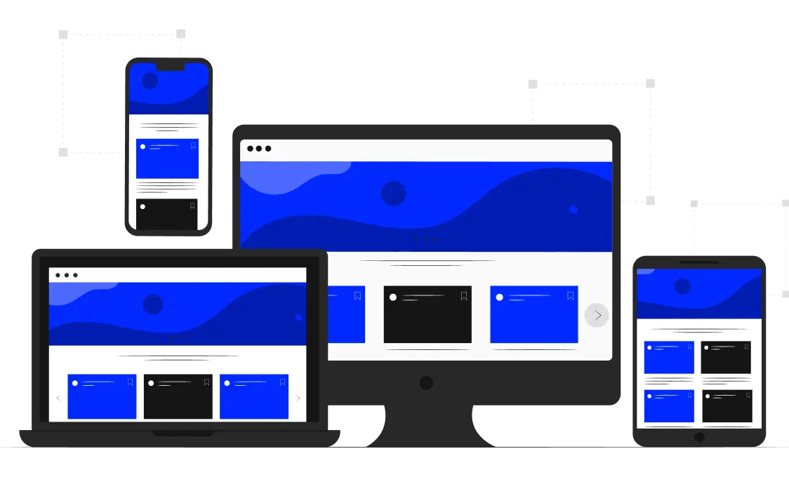
Responsive design (RWD) makes pages render well on various devices and window or screen sizes. Recent research shows that over 60% of traffic now comes from mobile devices, so it’s more important than ever for sites to be designed with them in mind. Here, in the UWS responsive web design agency, we make all of our sites responsive, so they look great and work well no matter what device they’re being viewed on.
The Concept Of Responsive Web Design
The basic idea is that a site should adapt its layout to the viewing environment, whether that’s a desktop computer, a tablet, or a smartphone. This is accomplished by using various techniques.
RWD isn’t just about making your site look good on different devices, though that’s certainly a key part of it. It’s also about making sure your site is as easy to use as possible, regardless of the device it’s being viewed on. In other words, it’s about creating a seamless user experience. For example, if someone is viewing your site on the phone, they should be able to easily tap on a button or link without having to zoom in or scroll around to find it. If you want to make your website easy to use, taking advantage of responsive web design services will be a good decision.
As we mentioned, over 60% of traffic now comes from mobile devices. But that’s not the only reason the responsive eCommerce web design is so important. It also offers several other benefits, including:
 Improved SEOGoogle has stated that RWD is its preferred method of mobile optimization.
 Faster loading timesSuch sites tend to be more compact and load faster than non-responsive ones since they don’t have to load unnecessary code or images.
 Higher conversion ratesA well-designed site will provide a better user experience, often leading to increased conversion rates.
 Greater flexibilityYou only have to maintain one site rather than two separate websites for different devices.
 Improved brand recognition and loyaltyA site that provides a great user experience is more likely to be remembered and visited in the future.
Screen Resolution
Screen resolution is one of the first things to consider when making a site. This is the number of pixels that can be displayed on a screen. A website that looks good on a high-resolution screen might look cramped and difficult to read on a lower-resolution screen. Therefore, it’s important to design your site to look good on all screen resolutions.
In the early days of the internet, screen resolutions were pretty standard. Most screens were either 640x480 or 800x600 pixels. However, as monitors became larger and higher resolution, designers had to start catering to a wider range of resolutions. Nowadays, there are a plethora of different screen sizes and resolutions that need to be taken into consideration, from small phone screens up to large 4K monitors.
Media Queries
Another important aspect is media queries. These CSS code snippets allow you to target specific devices. For example, you might use a media query to ensure your site’s font size is legible on the phone. Media queries are a key part of the design and are often used in conjunction with other techniques. In many cases, they’re the best way to ensure your site looks great regardless of the device it’s being viewed on.
Custom Layout
The site layout will also need to be customized for different devices. For example, you might want to have a two-column layout on a desktop computer but switch to a single-column layout on the phone. This can be accomplished by using a grid system. A grid system is a series of rows and columns that adjust based on the screen size. This allows you to create custom layouts that look good on any device.
Fluid Layout
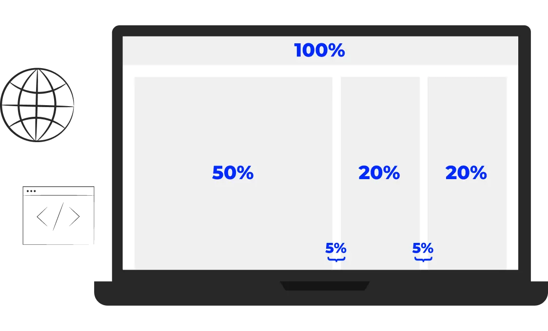
A fluid layout is a type of design that uses percentage-based widths instead of fixed widths. This means that the layout will resize itself depending on the screen size it’s being viewed on. Fluid layouts are often used in conjunction with media queries.
Showing Or Hiding Content
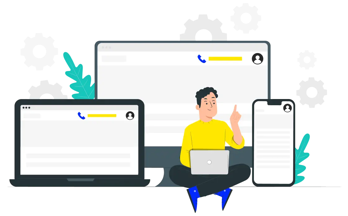
Sometimes you want to show or hide certain content on your site depending on the device it’s being viewed on. For example, you might want to display a phone number on a desktop site but hide it on a mobile site.
Responsive Images
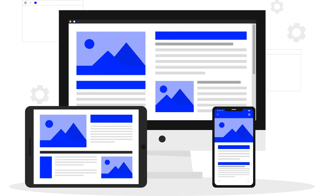
Images are another important aspect. They must be sized appropriately to look good on all devices. One way to do this is to use responsive web design techniques like CSS background images, inline images, and the picture element.
Speed Up Your Site
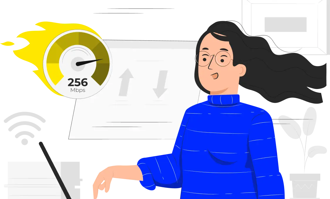
The next thing to consider is site speed. A site should be able to load quickly on all devices, regardless of the connection speed. Several ways to speed up your site include optimizing images, using a content delivery network, and minifying code.
Responsive Breakpoints
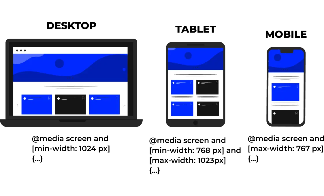
One of the most important aspects is breakpoints. These are the points at which the layout changes to better suit the viewing environment. For example, a website might have a different layout on a phone than it does on a tablet or desktop computer.
Our
Template
Here, in the UWS responsive web design company, we have a wide range of templates for you to choose from. All of our web templates of responsive design are designed by our team of professional designers. So, no matter which template you choose, you can be confident that the site will look great and work well on all devices. Contact us today to learn more about our responsive web design services or get started on your new site. You can also check out our portfolio to see some examples of our work.
In summary, RWD is an approach to designing and building sites that are easy to use and look good no matter what device they’re being viewed on. If you have a site that isn’t responsive, now is the time to consider making the switch. This is important if you want to improve your SEO or increase your conversion rates. Also, it will make it easier to maintain in the long run. If you need any help, UWS is one of the best responsive web design companies to help you with.

FAQ
What are your best examples of responsive web design?
We have many examples of design in our portfolio. You can also check out our blog for more information and tips to improve your design.
What is the purpose of responsive web design?
The purpose is to make your site look good on all devices and provide a better user experience. It can also lead to increased traffic and higher conversion rates for businesses.
We offer a free consultation and quote for all potential clients. Contact us today to discuss your specific web design and development needs with one of our experts.
Start a project